AirGo
Client: AirGo
Roles: UX Researcher & UX Writer, Website Auditor
Methods: Heuristic Audit, Usability Testing
Tools: Figma, Keynote

The Brief:
Audit the website of a social justice and activism focused podcast based in Chicago
What I Did:
I ran a heuristic audit of the website, developed a usability testing script, ran tests, and synthesized findings for the client to help them to better meet their goals of driving like minded, yet inactive participants to participate in their cause
Introduction
AirGo is a Chicago based podcast that is focused on civil rights, social justice, and activism. They are striving to build an archive of the social movement towards collective liberation in Chicago through long-form conversations. AirGo aims to be an accessible, engaging entry point for those who want to find their way into social movements.
The AirGo website serves several purposes for the organization: it is a resource hub, a portfolio of the hosts, a place to book guests for their show, and to book projects (such as workshops). Themes, topics, and resources mentioned or related to each episode are linked on their website with the corresponding episode. AirGo wants people to use its website to be driven to subscribe to their podcasts, better represent the scope of work that they do, to have people dip into their podcasting archives and delve more deeply into topics, and engage the hosts in podcast consulting.
The Process

Meet with Stakeholders
Heuristic Audit
Usability Testing
Design Recommendations
This process allowed for me to assess what AirGo’s goals are for their website, how well the website is currently meeting those goals both from my perspective as well as the perspectives of others outside of the organization, and then to make suggestions to help redesign the site to better suit a user’s experiences and AirGo’s needs.
The Research
How well is the current website meeting AirGo’s needs?
Are users able to fully engage with the content, intention, and mission of AirGo’s podcast?
Research Goals
AirGo has a lot of content. The hosts are quite prolific and have produced over 300 episodes of their podcasts! As podcasters, it is important that the AirGo website funnels users to listen to their content. Additionally, as activists, it is also important that AirGo’s listeners can engage further by reading, donating, and participating in social change. My goal for this project was to see if the amount of content on the AirGo website would make it difficult for users to achieve the main objectives of the site.
Heuristic Audit
What’s Working Well?
The AirGo website was doing quite a few things well. It was easy for visitors to listen to podcasts right on their website. Each episode was linked to a Soundcloud page where a user could engage with their content in just one click.

The vibe of the website, particular through the photography was warm and welcoming, and a visitor could feel connected to the hosts immediately.

Overwhelm
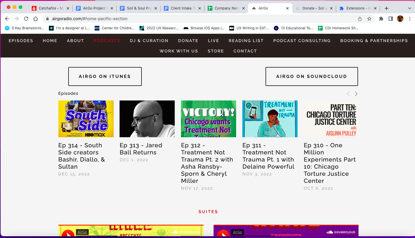
The amount of content, particularly as a visitor scrolls down the homepage, would cause for a user to feel overwhelmed. The Home, About, Podcasts, DJ & Curation, and Donate pages all existed together. The navigation bar was also particularly long and contained a lot of content.
I wanted to find ways to best break up the AirGo homepage into digestible pieces while also simplifying the navigation bar. For my usability tests, I wanted to confirm that others felt overwhelmed by the amount of content, too.
Recency
While AirGo is quite active with producing podcasts, the pandemic unfortunately had a negative impact on their live events. The page of the website dedicated to their live events showed all of their past live events, but had not included any events since the early part of 2020.

Subscriptions
AirGo’s website linked two podcast platforms for each of their episodes: Soundcloud and Apple Podcasts. While there are a lot of podcast providers out there, my feeling was that AirGo needed to offer a call to action or link other podcast apps to gain more subscribers.

The Design Iterations
Usability Testing
Usability testing revealed that AirGo’s website really was overwhelming for their visitors. The homepage in particular with its long scroll was too full of information, the information was too outdated, and there weren’t links to their preferred podcast providers.
Recommendations and Re-design
For the AirGo site, I made a few recommendations for improvements to simplify their site and streamline users to listen to their podcast, hire the hosts as consultants, and serve as an archive for their work.
Home Page
My recommendation for the home page was to reduce the amount of information on the home page, and break up the archival work into a separate page.

The navigation bar has been simplified as well to help streamline the user experience.

The themed suites have been moved to an archival page that AirGo has dubbed, “Dig in the Crates.”
Subscriptions
My recommendation was to offer more subscription links, in particular, a link to Spotify, which was the preferred app for several usability testers.

Take Action
My recommendation was also to encourage users to get involved with their causes through their website. The site was re-designed to include that as one of the tabs on the navigation bar, and it combined the reading and liberation resource lists. AirGo called the section, “Get Involved.”


Presentation
Below is the presentation deck that I showed to AirGo after my completion of the re-design project.
Next Steps
AirGo has completed the redesign of their website. I believe that their re-design will streamline a user’s experience. I look forward to hearing back from AirGo as they continue to produce content and grow.

